Autodesk · commerce platform design
From discovery to subscription
A multi-year journey to transform how millions of visitors discover, consider, buy, and manage professional design software at scale.
Role
Principal Content Designer, XD Strategy and UX Design teams
Scope
Discovery, consideration, payments, and payment management
Timeline
July 2019 to February 2024
Outcome
20% trial starts, 8% conversion
Context
Autodesk is an American software company best known for making 3D design, engineering, and entertainment software like AutoCAD, Revit, and Maya. Autodesk.com serves architects, civil and structural engineers, manufacturers, designers, and animators across dozens of countries, transacting in multiple currencies, with a range of consumption models.

In 2019, I began my multi-year journey working to transform the full customer journey. From free subscriptions for educational institutions to providing paid access for designers from some of the largest users of 3D software in the world.
The XD Strategy Team I joined worked horizontally across all web experiences built for prospects, customers, agents, and partners. When I joined, domains for marketing, support, and user communities were each hosted on three separate publishing platforms.
Outside the US, a mix of third-party vendors was needed to handle payment processing, a legacy from the days when the entire process was exclusively handled by resellers.
One header for three domains
Marketing, support, and community each had their own navigation. One universal header came together in steps, starting with a Me menu, then a country and language selector and a product flyout, with labels researched and tested along the way.
How the work moved
This work didn’t run in a straight line. It crossed two teams and several rounds of leadership change, so pieces that started under one set of leaders often finished under another.
2019 to 2021, XD Strategy. I joined XD Strategy as its first principal content designer, alongside service designers and the information architect. Another content designer focused only on Account experiences. The team reported up to Autodesk’s first Chief Digital Officer. This was the North Star era, the universal navigation effort across the three domains, and the move to one design system for autodesk.com, with a second system built for the apps and tools. When a new logo arrived, the team had seven months to convert everything to the new palette.
Around 2021, the break. The Chief Digital Officer moved to lead the org that builds industrial design tools, and the head of design left. My manager left soon after, and the rest of XD Strategy went in different directions until all of them had left. The navigation work was deprioritized, and the Gateways pod was broken up.
2021 to 2024, UX Design. I moved to the UX Design team, again the only content strategist on a team of UX designers. My title stayed Principal Content Designer, though most people called me the content strategist. The focus became payments, checkout, free trials, and new ways to buy, like Flex tokens. After a couple more changes in design leadership, a new lead took on design systems, visual design, and content design. That lasted until I left in February 2024.
The Acts below follow the customer’s path, not that order. Where a piece has its own page now, its Act points there.
Act 1:Discovery
The North Star project
The team was made up of UX and visual designers, full stack engineers, researchers, and content strategists from all across the organization. Our focus was a re-imagining of critical touch points, approached through the lens of personas representing key demographics, grounded in industry trends, research, and historical data gathered.
The approach typically started with a statement of the current problem, what it represented in opportunity costs, or missed opportunities to delight, and then shifted to:
- Why don’t we know the customer better?
- What if we could personalize based upon who they were?
- How might we anticipate what they need?
The site’s existing navigation, product pages, and pattern library were challenging to build upon and optimize. With a catalog of nearly 100 products, it was difficult to get all products to adopt them and optimize at scale.
Adding to the complexity, A/B tests run on a high-traffic product page like AutoCAD might not tell us anything useful about more niche products like Autodesk Alias.
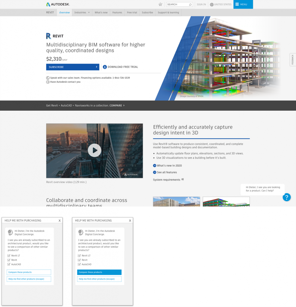
The net outcomes of the North Star were inspirations and high fidelity mock-ups that were built to show what was possible. This investment in future innovations would inform the design improvements that followed in the years to come.
Prioritization
The Gateways Pod was charged with optimizing and prioritizing the high-traffic landing pages. Research, analytics, and page performance informed our tactical objectives, while UX leadership drove strategic goals, some inspired by the North Star, that would help us achieve the next-level growth.
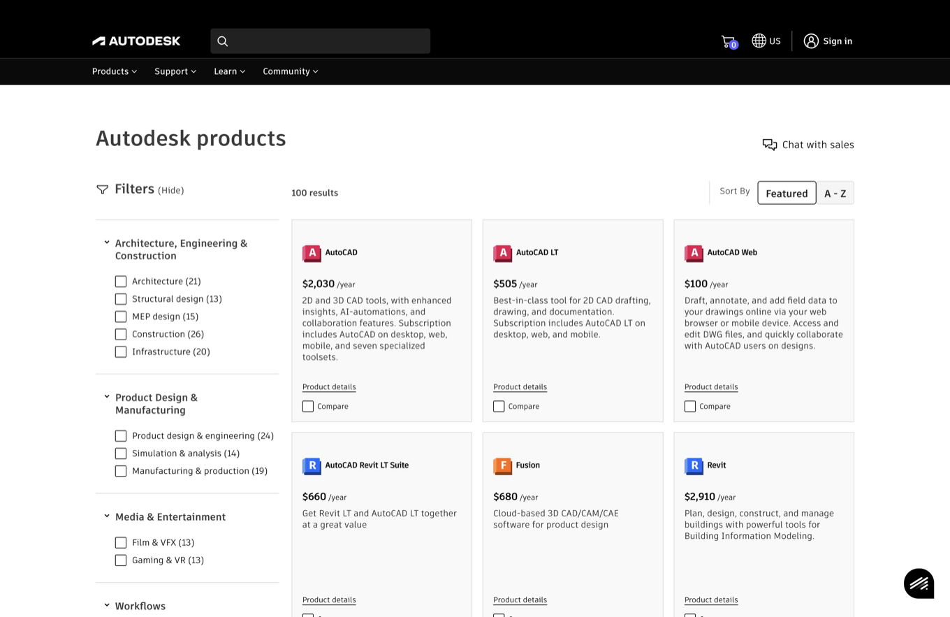
Initially, there were four pages competing for the same traffic: the Free Trials, the Buy page, the All Products, and the Product Center. Each served a different state of discovery, consideration, and subscription.
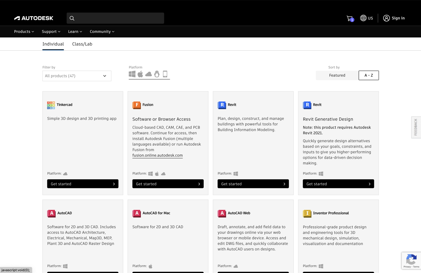
The consolidated All Products page became a single discovery surface for the full catalog. A filtering mechanism was built for easier sorting and faster page loads for top products.

Defining the industry categories and workflows was content work. I collaborated with technical product marketing subject matter experts (SMEs) to name and break down the structure of each industry category Autodesk customers actually think in.
This work helped inform related product recommendations, comparison opportunities, and upselling product bundling as well as data science explorations into which products played best together, based entirely on the industry focus of the customer.
Free trials and viewers
Most free trial visitors weren’t there for a trial. Students wanted educational access, others only needed a viewer, and real trialers faced a long setup. Each audience got its own path, rebuilt from approved pattern library components.
Act 2:Consideration
Comparing products
Choosing between professional tools was harder than it needed to be. Comparing products was one of the most common reasons people visited the site, and the experience for doing it needed real improvement. Search traffic for product comparisons was dominated by companies representing themselves as experts, often with incorrect or outdated data, and those sites ranked well above Autodesk’s own organic results.
Customers struggled to find system requirements, pricing and product differentiation lacked transparency, and duplicate product information (educational versus commercial) cannibalized each other’s search traffic.
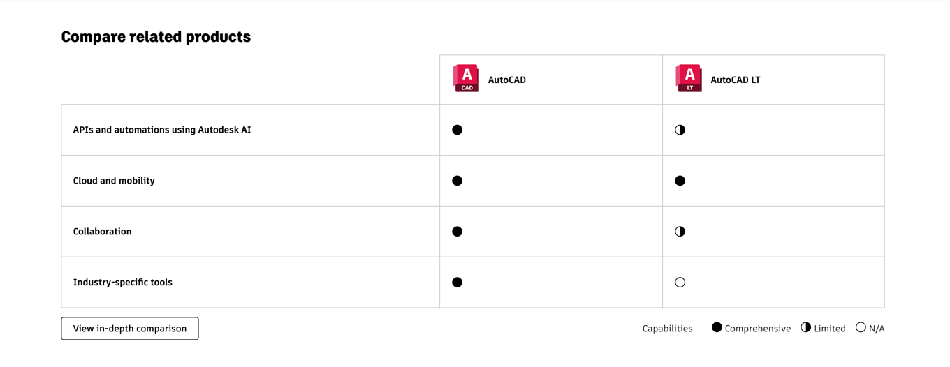
The resulting request was for a new comparison framework: a flexible template added to the pattern library, with limits on comparing unrelated product families, curated workflows for high-level views, linking components for deeper dives, and usage guidelines so publishing teams could deploy comparisons without design intervention.
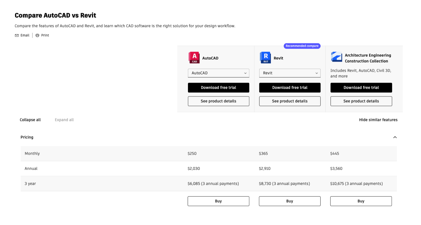
I built the pilot comparisons for the six most-searched products in consultation with technical product marketing SMEs, worked with product marketing to assemble the comparison content tables and choose which products to compare, and developed and published the usage guidelines. A compare panel component brought high-level workflow comparisons onto product center landing pages, and an in-depth view handled up to three products at once.
The leaders who asked for the pattern saw it as a breakthrough. Some product teams weren’t convinced and didn’t want their own products compared head to head. 3ds Max and Maya, for example, are both animation packages, and only their most devoted users could tell them apart.
Comparisons published and optimized faster, SERP rankings for top Autodesk product comparisons improved, and engagement with product centers and trials increased.
Today the pattern appears only on the AutoCAD and Fusion pages, where it compares them with products from other companies. That use wasn’t on the agenda when the pattern was built.
Fusion: graduating from incubation
Fusion started in incubation, with one-off pages and fewer guardrails. Its move to the standard product center gave it pattern library components, features by role, and a path from free personal use to paid plans. Trial starts rose 20% and conversion improved 8%.
Educational access at scale
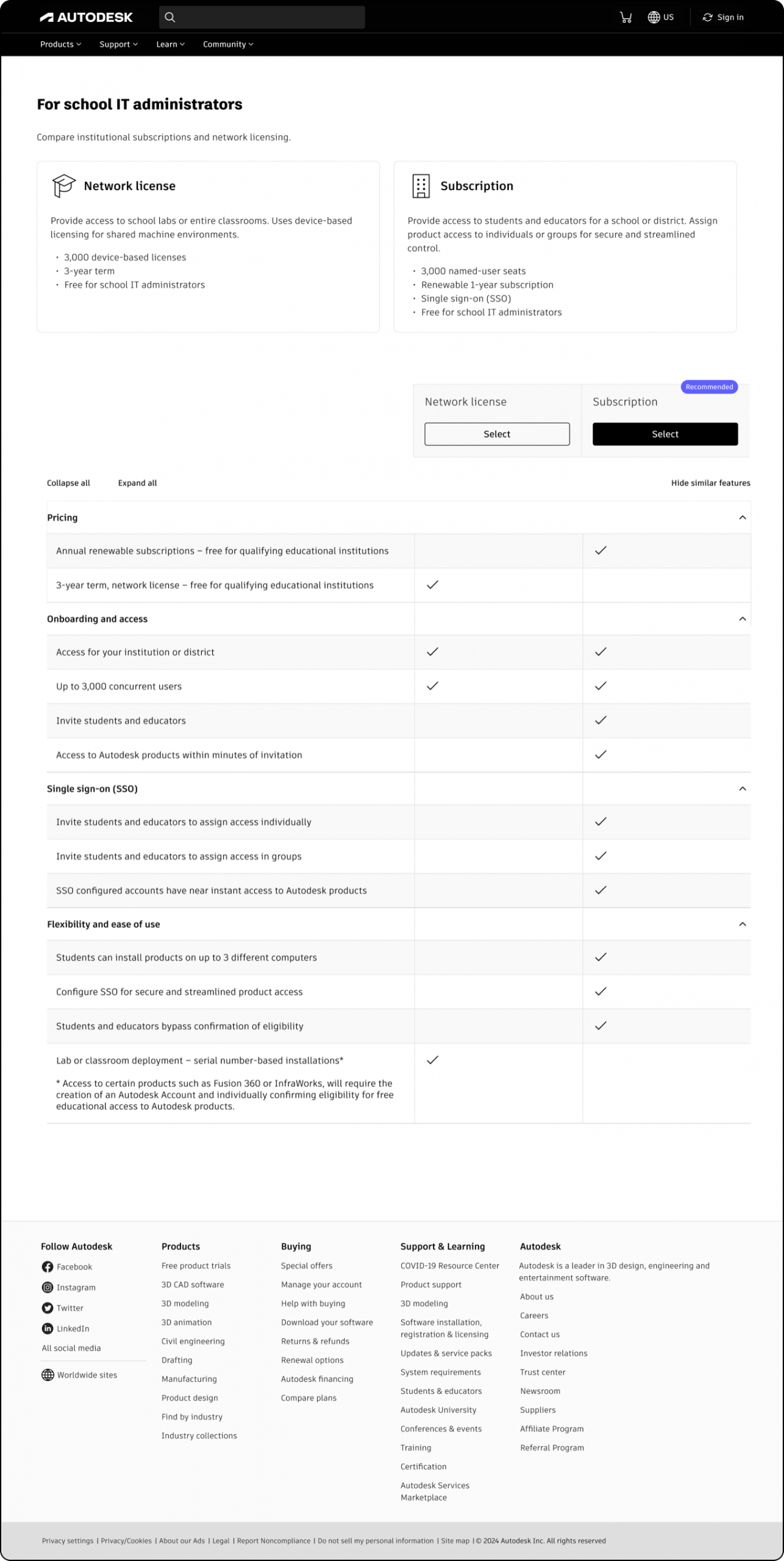
For educational institutions, IT admins enable Autodesk products for students and teachers at scale, and the available consumption models were evolving and hard to parse. The product designer leading the end-to-end overhaul requested help with the content.
I saw the opportunity to apply the comparison panel, and that format shipped, putting the two IT admin subscription options side by side while recommending the newer one for admins deploying as many as 3,000 seats. The redesign organized onboarding by audience segment using standardized product cards and simplified checkout flows for every segment. Comparisons published faster, checkout aligned with the mini cart patterns from Act 3, and a foundation set for easier transition to paid subscriptions.
Act 3:Payments
The Buy team owned the moment of commitment. A right-rail mini cart kept the focus on checkout, with term and seat controls, offers that make their case, and whatever payment method a buyer had available. In its first 30 days, checkout page conversion rose from 23% to 45%.
Act 4:Payment Management
Payment methods were hard to find, and changing one often took a phone call. A Payment Center in Autodesk Account, launched in September 2023, put every method in one findable place. In its first 30 days, customer effort score for updating payment information rose from 59% to 71%, and $2.4M in revenue was saved.
PostScript
The taxonomy that organizes discovery feeds the comparison framework that drives consideration; comparisons drive engagement to product centers like Fusion; persona-based options hand off to a cart extensible enough to finance a purchase in almost any market; and the same self-service philosophy carried past the sale into payment management, where it saved measurable revenue.
Need help with scale?
Let’s remove the blockers and start building that dream.