Kaiser Permanente · Content strategy
Simplify access to health care
Late in 2015, Kaiser Permanente was migrating kp.org off a legacy CMS onto Adobe Experience Manager. I came in as a contract senior content strategist, assigned to develop governance models for global components like the header, footer, and site-wide alerts. That included how to handle the document files members regularly requested. Building taxonomies and auditing existing governance was the first stop.
Senior Content Strategist. On the kp.org migration to Adobe Experience Manager. Dec 2015 to Apr 2016.
Problem
kp.org was moving to a new CMS with an uninventoried archive, a footer every team wanted a piece of, and a site-wide alert system nobody had designed.
Move
Audit the content, organize the footer by visitor intent, and define criteria for categorizing alerts.
Outcome
A content model, a footer structure, and recommended alert categories for the new platform.
The context
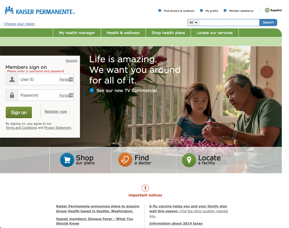
Kaiser’s digital presence spanned more than one site. Kp.org carried the member and plan-shopping experience, thrive.kp.org carried wellness content, and each had grown its own header and footer with no shared logic for signed-in versus signed-out. Underneath both sat eight regions with their own versions of the same content.
Act 1:Auditing a digital filing cabinet
The Forms and Publications section was regionalized but inconsistent, without a shared model. Before we could solve the structure problem, we needed to find what it contained. I scraped every document and link from the Northern California page and separated real content from header and footer noise. I loaded the unique items into Airtable to query for patterns.
The Newsletters and articles page had sixty-six links, of which fifty-eight were the site’s own navigation, repeated. Eight were actual content, and three of those were not even newsletters. The page was almost entirely scaffolding.
A rationalized information architecture
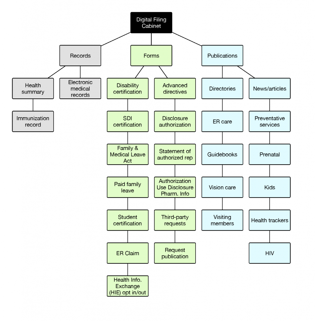
We were moving from an information architecture based on an organizational chart to a content model that could inform publishing and the CMS regardless of language or region. The model lists each document once. Language is not a level in it, and neither is region. The Health Information Exchange opt-in, which the audit had found listed twice under two different names, resolves to a single node.
Data requests
The inventory covered Northern California only. I requested the available analytics for all eight regions, July 2015 through February 2016, to find out whether one region’s page held everywhere. It held. Across sixty-four region-months, newsletters never broke four percent of category traffic. Forms and plan-services publications carried nearly all of it, and both spiked every January at open enrollment. In Georgia, plan services nearly quintupled.
Forms and Publications: monthly article visits
Newsletters never broke four percent of category traffic. Plan services nearly tripled in January, at open enrollment.
- Forms
- Plan services
- Newsletters
View the data
| Month | Forms | Plan services | Newsletters |
|---|---|---|---|
| Jul 2015 | 5,688 | 4,598 | 316 |
| Aug 2015 | 6,544 | 4,521 | 336 |
| Sep 2015 | 5,529 | 4,185 | 336 |
| Oct 2015 | 5,656 | 4,207 | 364 |
| Nov 2015 | 5,422 | 3,833 | 285 |
| Dec 2015 | 4,997 | 4,109 | 197 |
| Jan 2016 | 6,413 | 11,570 | 282 |
| Feb 2016 | 7,533 | 11,801 | 350 |
Source: Webtrends data request, kp.org, Northern California, July 2015 to February 2016
The audit was a pilot on one regional page, so I recommended repeating it across all eight before committing to a final architecture. Separately, the research team ran a card sort on the same area. More than half of participants split forms from informational resources unprompted. Members arrived independently at the structure the inventory implied.
Act 2:A footer with a rule behind it
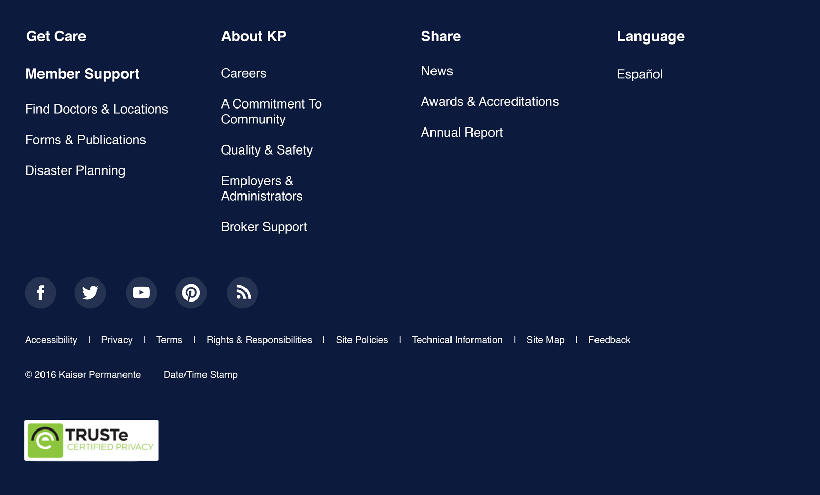
The footer was a flat list of thirteen links with no sections, and the future-state version had to serve two properties, eight regions, and both authentication states.

I suggested rules that let historical usage set priorities, rather than who asks loudest. Personalize before and after login, by region. And for anything proposed, answer the question: why? Was it popular, required, or something we needed to promote?
Scroll and heat maps of the Thrive home page settled the sizing argument. Most of the page went unseen on the way down, which turned the question from how many links would fit into how few could be justified. The recommendation was four columns and about thirteen links, sectioned, with the seal and the broker and employer links hidden from signed-in members because a member is not shopping for a plan.
Act 3:Alerts in need of governance
The Important notices component was used for everything from flu season to wildfires. I audited what it was carrying and who was putting it there. One example I saw held nine notices at once, published by four different groups, with no order, no priority, and no way to tell which one mattered.
I exported a publishing history. It showed roughly thirty site-wide notices posted between September 2014 and March 2016. Ebola, the 2015 measles outbreak, wildfires, a North Bay earthquake, a data breach, labor actions, the Supreme Court’s ACA ruling. At least fourteen different publishers, and no shared rule for scope, priority, or when anything came down.
A lightbulb moment
The existing CMS had an expiration date field built into the table of notices, and none of the records had an expiration date. That meant nothing was ever scheduled to be turned off. Notices came down when somebody remembered, so the page recorded what each team lobbied most recently about rather than what a member needed to know.
No amount of visual hierarchy fixes that. An empty field on thirty records is a governance gap.
The click data showed what it cost. One live link read “Click here for more information.” It drew 896 clicks and nobody could say what for.
Seasonal trends
- Flu vaccine notice
- 2015 tax notice
| Notice | Q4 2015 | Jan–Feb 2016 |
|---|---|---|
| Flu vaccine | 8,895 | 1,219 |
| 2015 taxes | ~2,400 | 6,271 |
Flu was the most clicked notice on kp.org in Q4 2015, more than every other notice combined. By January and February taxes had overtaken it. The panel had no way to respond to that, because nothing in it could expire, reorder, or step down.
Source: kp.org click data from the 2016 alerts audit. The Q4 tax figure is an estimate, read from the bar height in the original chart.
Alert governance
Step 1 · where notices sat in 2016
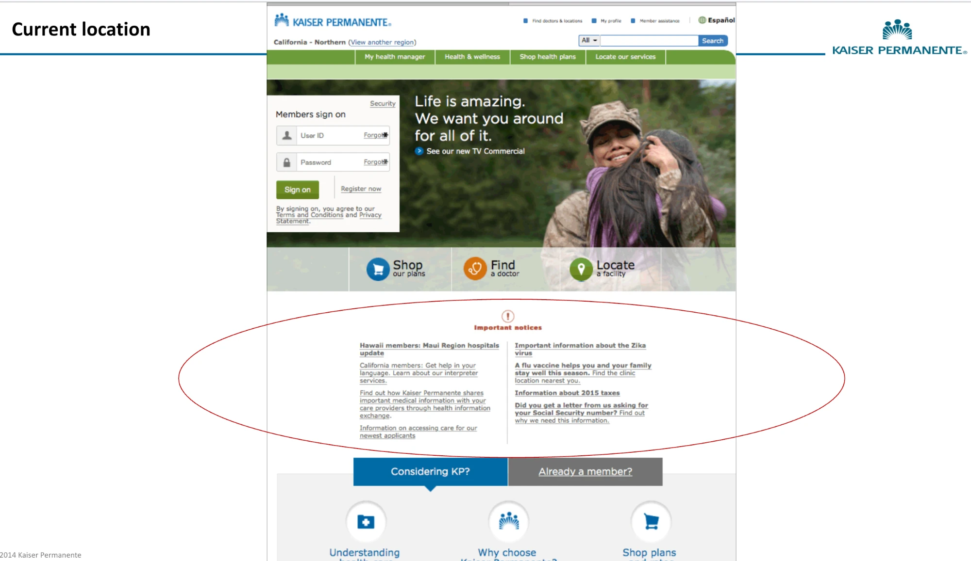
Nine notices just below the hero, every word a link, all in one style. An epidemic looked the same as a tax form. From the audit deck, 2016.
Step 2 · the rules
| Tier | What qualifies | Where it shows | When it comes down |
|---|---|---|---|
| P1 | Emergencies, natural disasters, security threats, outages, cyber or terrorist attacks, health and safety epidemics | Site-wide | Reviewed daily, case by case |
| P2 | Work stoppages, security breaches, facility closures, service interruptions, travel concerns | Site-wide | Expiry date and time required |
| P3 | Flu vaccine, tax document availability, new regional locations, added services | Important notices panel only | Expiry date and time required |
Adapted from the kp.org Alerts guidelines deck, slide 10 (2016). Each tier also names an approver.
Step 3 · the rules applied, today’s format
kp.org now serves nine regions. Each member sees what applies everywhere, plus their own region’s notices.
Important notices
Text links shown are not active. Illustration only, using the 2016 notices rewritten to approximate the current style.
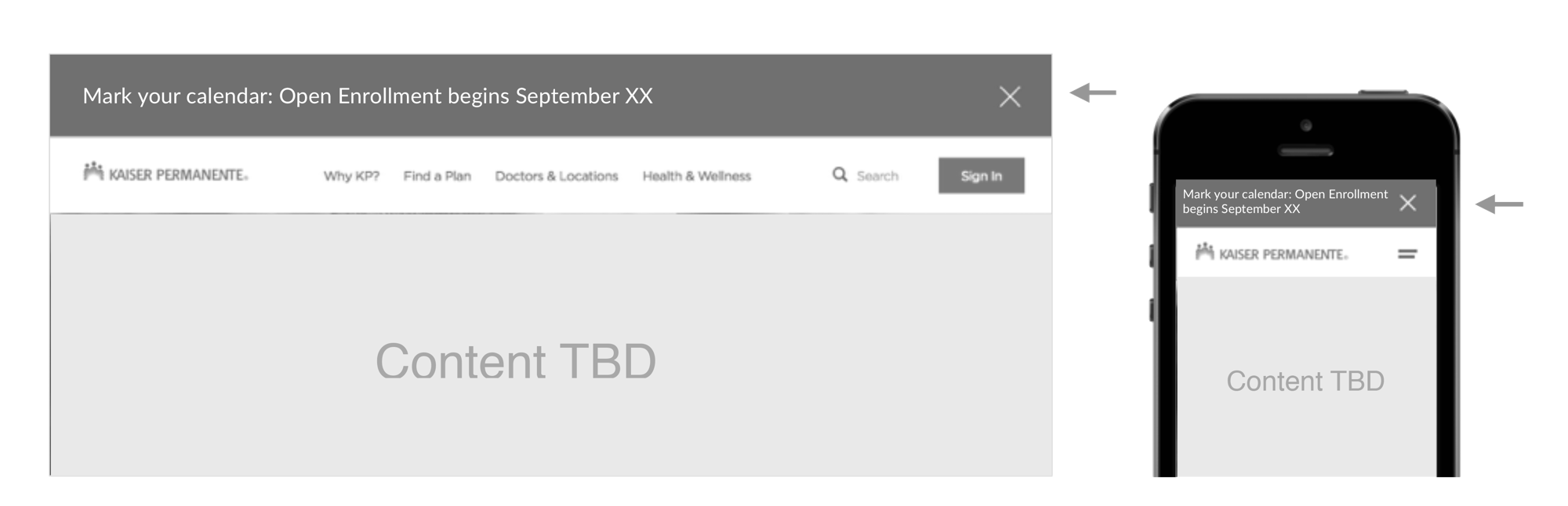
Alerts were never only a content problem. More than a dozen groups looked to the Integrated Marketing and Communications Issues and Crisis team for principles to inform what gets published.
- Deliver care first and treat financial concerns as secondary.
- Be a compassionate, responsible provider and employer.
- Share information quickly and openly.
Placement for P1 and P2
PostScript
My piece of the migration mapped what actually sat behind Forms and Publications. It argued a global footer down to something a member could use and a health system would approve. It also turned a decade of ad hoc notices into a system with tiers, expiry dates, and an owner for each.
The tiers went into the backlog as written requirements to inform a criterion for judging what a notification is and where it belongs. The tiers couldn’t settle one tension: sharing information quickly and openly runs against an approval chain, and it still does.
Kaiser was the project that truly opened the door to a new career direction and, with the encouragement of fellow content strategists, led me to PayPal.
Working on something with this shape?
Content models, publishing governance, and the part where a dozen teams have to agree on one thing. If that is the problem in front of you, book half an hour and we can talk it through.