PayPal · Content strategy
One brand, for every market
PayPal.com is one of the company’s largest customer touchpoints, and marketing teams all over the world publish into it. This is how a component library, a set of guidelines, and the words inside the authoring tool itself turned that into a system a marketer in any region could use without breaking the brand.
Content Strategist, Dotcom Marketing. On the global PayPal.com team that regional marketing units published through. May 2016 to Apr 2017.
Problem
Dozens of regional teams published into PayPal.com, and every page was a custom build held together by diligence.
Move
A named component library, design system guidelines, and UX copy inside the authoring tool itself.
Outcome
A shipped system any regional marketer could publish with, without breaking the brand.
The context
In 2016, PayPal’s marketing site received over 200 million unique visitors every month. It works less like one website and more like a publishing surface that dozens of regional marketing teams write into, in their own languages, for their own markets, against their own campaign calendars.
Those teams had plenty of pages, and every one was a static, custom instance. A hero built in Australia had nothing to do with a hero built in Germany, and the only thing holding the brand together across them was diligence.
The team that took this on was cross-functional and small for the size of the surface. It included a chief product owner and technical product owner, front-end and product design, visual design, two UX roles, and a content strategy function led by a manager. I worked as the content strategist executing day-to-day component naming, definitions, and copy across that system. Before the build started, the whole team went through Agile Scrum training together, setting the cadence the work ran on. Company-wide, all the engineering teams were being aligned on the same two week sprint schedule.
The output was a system called Canvas. It combined a component library, a publishing framework, and a set of guidelines that told marketers what to reach for and why.
Act 1:What a page is made of
Canvas treated a page as something assembled from parts. The model was atomic design. Atoms combine into organisms, organisms into templates, templates onto a publishing framework called MPP that carried analytics, tagging, responsive grid, and interaction standards underneath every page.
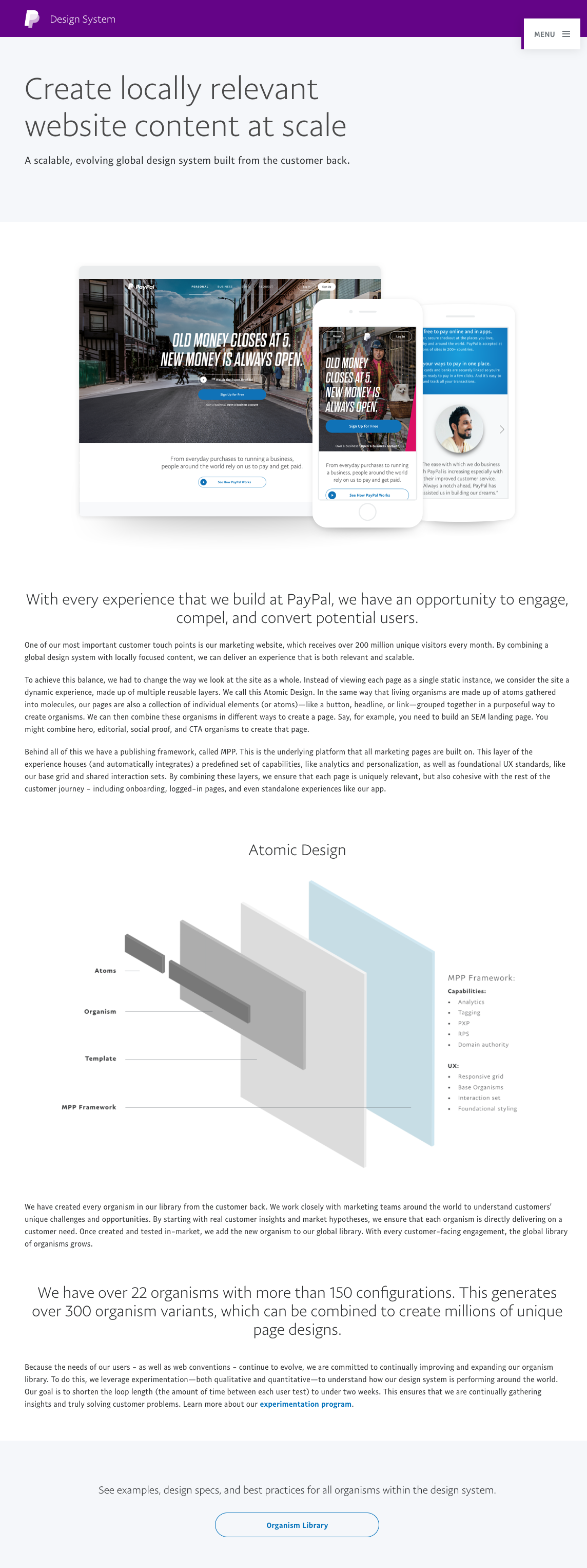
That structure only works if people agree on what the pieces are called. So the library was organized by what a marketer was trying to do. Twelve categories: Hero, Compare, CTAs and links, Featured merchants, Features and benefits, Fees and pricing, Offers, Page elements, Social & testimonial, Steps, Video, and Footers. Each one opened onto named organisms with their content slots spelled out, so Multimedia Panels Accordion listed image, panels, columns, CTA, device, video, accordion, links, and text before you committed to it.
At the point these screens were captured the library held 22 organisms with more than 150 configurations, generating over 300 organism variants.

Act 2:Locally relevant at scale
A global design system and locally relevant content pull against each other. Push too hard on consistency and every market gets a page that reads like it was written somewhere else. Push too hard on autonomy and the brand stops meaning anything.
Canvas resolved that by fixing the structure and freeing the content. The organism was standard. What went inside it was the market’s call. A regional team could not invent a new hero pattern, but they could decide what the hero said, which proof points earned space, and which offers were worth the page.
The guidelines had to carry that argument to people who did not report to the design system team and had campaigns to ship. Its navigation followed the same marketer-first logic, with five sections named Introduction, Design, Build, Evolve, and Get help. The introduction told marketers to “use these resources to build pages that inform, engage, and motivate customers to sign up.”
Every organism was created from the customer back, tested in market, and only then added to the global library. The team held the loop length between user tests to under two weeks.

Act 3:Writing the tool that writes the site
The part of this work that was most clearly content design never appeared on PayPal.com. It appeared inside Canvas.

Every organism needed a definition that a marketer could act on in one read. It said what the component is for, and when to reach for it.
The authoring view put the page composition beside the live preview, so the stack of organisms on a page was visible and editable as a list. Each organism entry carried a documentation scaffold behind it with four fixed sections, covering required elements, style, best practices, and options. Fixed sections are a content decision.
A third tool solved a more human problem. Dozens of regional marketing teams and agency partners needed to tag their own page events consistently for reporting and optimization. Most had no engineering or analytics support on hand. In collaboration with our SEO and analytics partners, I built a generator in Airtable to assemble structured IDs. The format was designed to be used consistently, so finding a pattern in a spreadsheet of thousands of click events could be more human-readable.
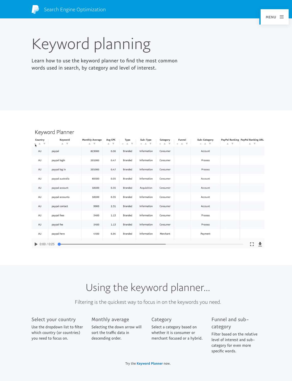
The same thinking produced the keyword planner. Search data on its own is a spreadsheet. The taxonomy laid over it made it usable. Every keyword was classified by country, type, sub-type, category, funnel stage, and sub-category, so a marketer could filter to consumer-facing acquisition terms for their unique market challenges. The instructions were written as four plain questions. Which country? How much volume? Which audience? Where in the funnel?
PostScript
The through-line is that a design system is a language before it is a library. Twenty-two organisms only reduce anyone’s work if the labels are clear, the definitions agree with each other, and the tool explains itself in the moment someone is using it. That is content work, and almost none of it is visible on the finished page.
Regional marketing teams got a platform for publishing pages that were recognizably PayPal without being handed someone else’s words.