Autodesk · Mini cart · content design
Focusing on intent
Almost anything you did on Autodesk.com pulled you away from finishing a purchase. This is how a right-rail mini cart kept the focus on checkout, with offers that make their case.
Principal Content Designer, UX Design team. Writing the cart, offer, and recommendation content with UX, e-commerce, and data science. Jul 2019 to Feb 2024.
Problem
Almost any action pulled buyers away from completing checkout. Which payment methods they could use depended on where they were based, the size of the commitment, credit history, and more.
Move
One extensible mini cart in the right rail, built to stack on a phone, with term and seat controls, per-product offers, and recommendations that say why products belong together.
Outcome
In the first 30 days, checkout page conversion nearly doubled, from 23% to 45%. Average order value rose more than 10%.
The context
The Buy team owned the moment of commitment. That covered subscriptions, renewals, and a growing range of ways to pay, from prepaid Flex tokens for occasional use to seats that admins assign across a company.
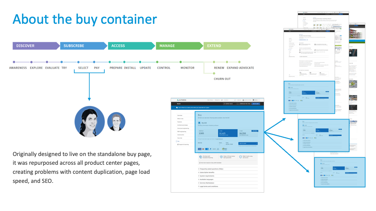
Each new way to buy used to need its own design. The goal was one cart architecture that could take on payment options, incentive messages, and per-country rules without a redesign. The aim was to help people complete checkout without distraction, with whatever payment method they had available.
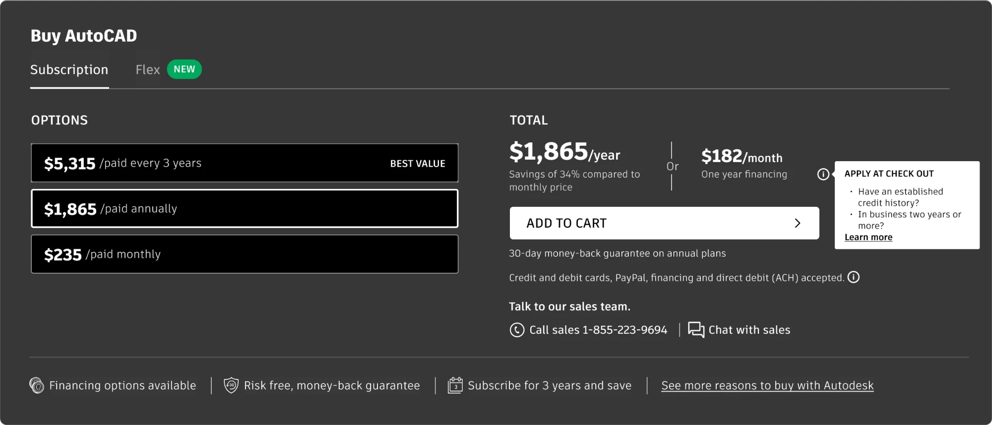
The buy container sat on every product center. It showed pricing, terms, and payment options at a glance, before anything reached the cart. It was prime real estate and every part underwent extensive scrutiny and testing.
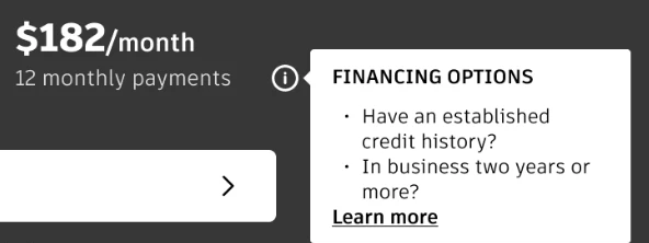
One financing test kept the container the same and changed only the words. The monthly price read “One year financing” or “12 monthly payments,” and its tooltip led with “Apply at check out,” “Financing options,” or “For eligible businesses.”


Act 1:One cart, many ways to buy
The mini cart launched on May 17, 2023. It opens in the right rail when you add a product, so the focus stays on finishing the purchase.
From there you can switch the term, add or remove seats, remove an item, keep shopping, or check out. I wrote the content across it, from labels and buttons to the term and seat controls and the error messages.
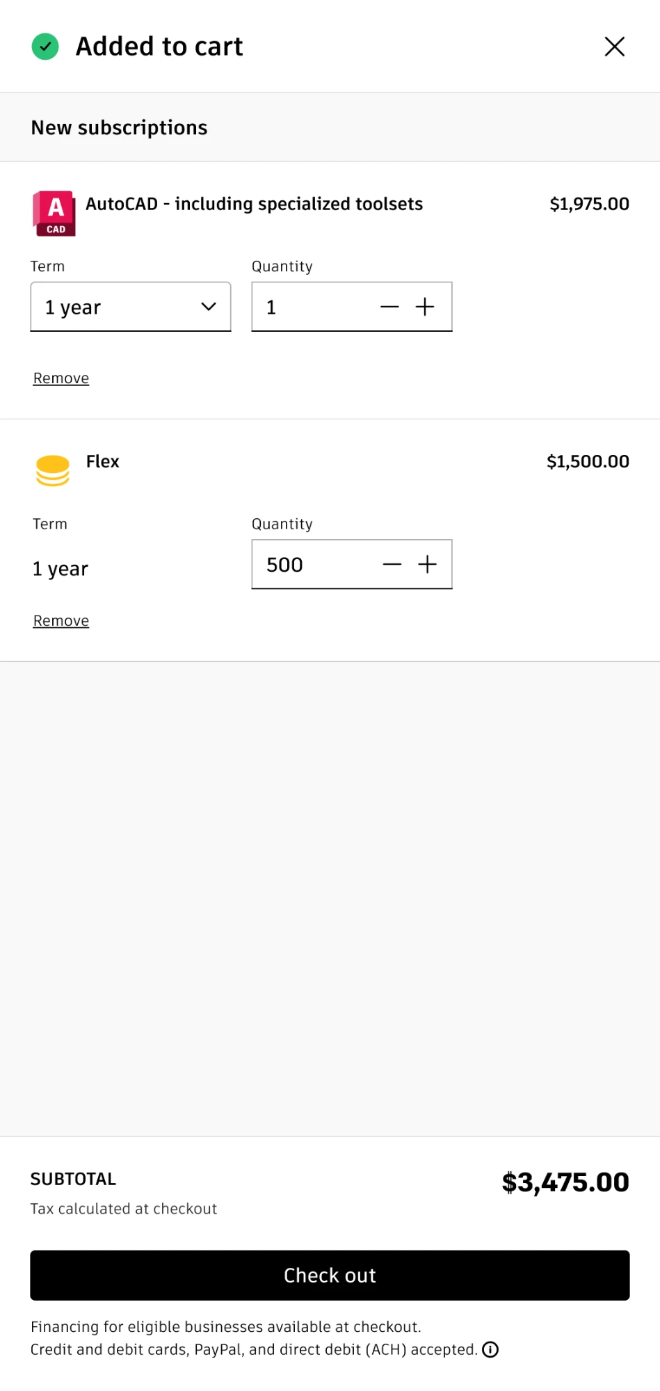
What the cart offered depended on the buyer.
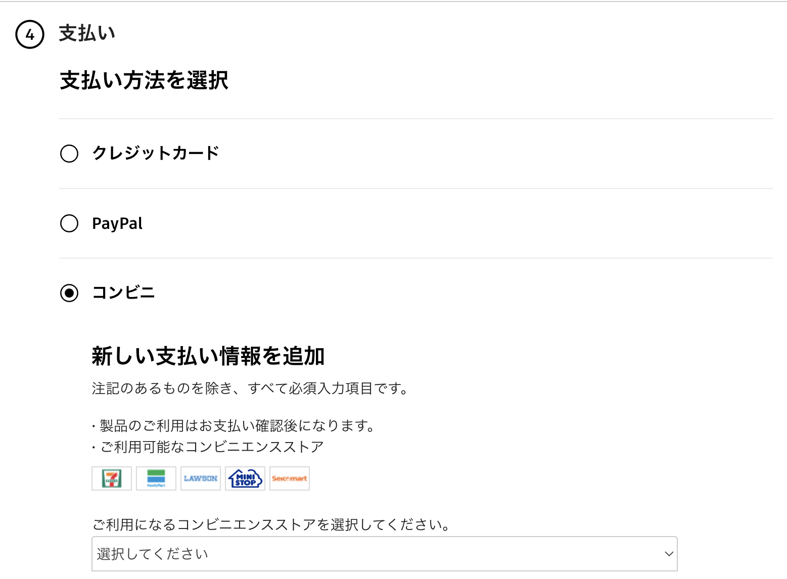

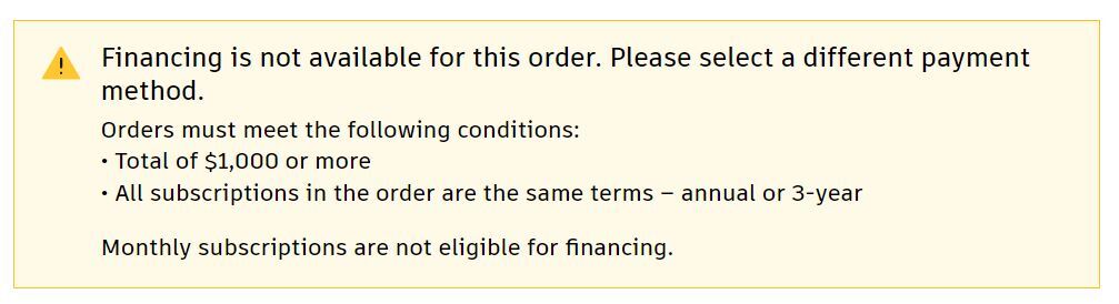
The panel follows the same vertical pattern as the Me menu and the country and language selector. It stacks on a phone the same way.
Act 2:Offers with a narrative
Data science and e-commerce teams studied purchase history. Customers who bought one product were likely to buy another later, depending on their industry. That made the cart a place to recommend what came next.
Discovery didn’t stop at the cart. AutoCAD, Autodesk’s single largest source of revenue when I started, was a Swiss Army knife of sorts, covering 2D, 3D, and documentation. A civil engineer might be better served by Civil 3D for planning and maintenance. An architect working in building information modeling would reach for Revit. Someone in one product center might not yet know the specialty tool they should be considering.
The narrative was harder than the placement. A recommendation only persuades if it resonates with the person completing the transaction. That might not be the end user.
I worked with subject matter experts and technical product marketing leads for each featured product. Together we wrote feature narratives keyed to the product already in the cart, such as better collaboration, tighter document control, or faster approvals.
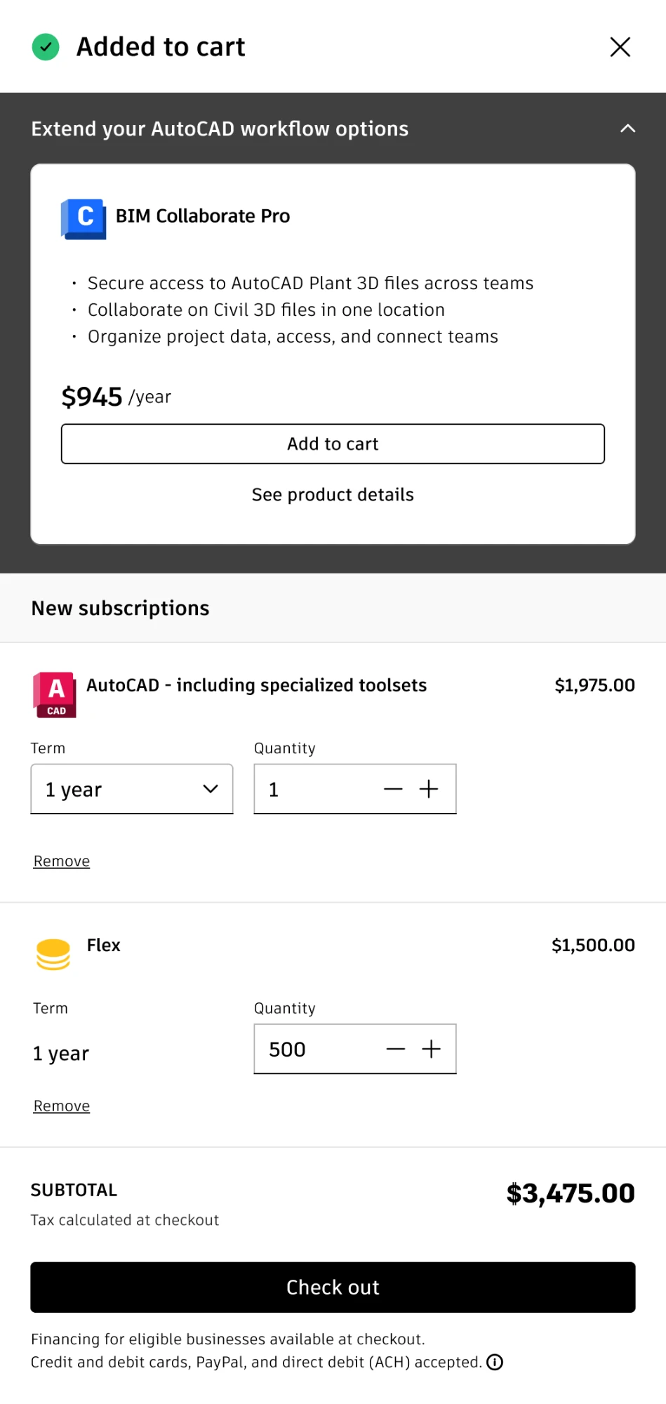
Offers got the same care. Each product had its own offer panel, with a short list of what’s included, the price, and a way to add it or see details.
Act 3:Holding on to intent
Not everyone finished their shopping in one sitting. Following well-worn examples like Amazon, we explored messages to keep a cart from being lost before the purchase was complete. The labels were the variable and underwent A/B testing for optimization.

PostScript
In the first 30 days with the mini cart, checkout page conversion rose from 23% to 45%. Average order value rose more than 10%.
The recommendation narratives were still being measured when this phase wrapped. The extensible cart kept every experiment cheap to run and cheap to retire.
New ways to pay grew alongside the cart. Making payment methods findable covers that side, and the Autodesk page carries the rest.
Shoppers dropping off between cart and checkout?
Let’s keep them where they are and tell them why.