Autodesk · Free trials and viewers · content design
Consideration work
Autodesk’s free trials page drew far more than trial seekers. This is how students, hobbyists, and people who only needed to open a file got their own paths, step by step.
Principal Content Designer, XD Strategy, then UX Design team. Pre-purchase content across free trials, viewers, and onboarding, with UX design and product marketing. Jul 2019 to Feb 2024.
Problem
Most free trial visitors weren’t there for a trial. Students wanted educational access, others only needed a viewer, and real trialers faced a long setup before they could even open the product.
Move
Give each audience its own path, with education and viewer cards, plain eligibility language tested with users, and FAQ answers rewritten for the questions people actually asked.
Outcome
Rebuilt from approved pattern library components, the trial start got shorter. Educational access went to those who qualified, and people who only needed to open a file found an updated Free Viewers page.
The context
Other teams generated the demand that brought people to the site. Our work was to make the most of that traffic once it arrived. This is where things stood from January to August 2019, around the time I joined.
Getting that traffic to a trial was only half the job. The customer lifecycle was meant to divide the work neatly. Pre-purchase was mine, and post-purchase went to a fellow content designer.
The split had a cost. Onboarding counted as post-purchase, so it sat far from the trial experience in consideration. Autodesk products have steep learning curves. A new user needed easy instructions, offers of pro help for enterprise customers, training, community, and support, before being thrown into the deep end.
Act 1:Who was really visiting
Four pages were competing for the same traffic, the Free Trials page, the Buy page, All Products, and each Product Center. Each served a different stage of discovery, consideration, and subscription.
A site-wide survey asked visitors why they came. Students outnumbered every other group, and free trials came second. In the open comments, “student” was the most common word, in about one comment in eight.
Two reasons dwarfed the rest, looking for free software as a student, and starting a free trial, together outnumbering every other reason on the list combined.
- What this section is about
- Every other reason for visiting
View the data
| Reason | Responses |
|---|---|
| Student | 185 |
| Free trial | 144 |
| Product research | 46 |
| Find learning | 43 |
| Other | 33 |
| Price research | 19 |
| Download product | 15 |
| Buy | 9 |
| Manage account | 8 |
| Viewer | 7 |
| Help | 6 |
Source: site-wide Qualtrics survey, May 25–31, 2020.
The findings told a story of misdirection. Students, real or pretending, were looking for educational access. Search traffic for free student software was cannibalizing commercial organic search. A sizable group only needed a free viewer to open a 3D file.
Act 2:A path for each audience
We stopped treating every visitor as a trial prospect. The free trials page gained two cards, Educational Access and Free Viewers, so each audience found its path without derailing the commercial one.
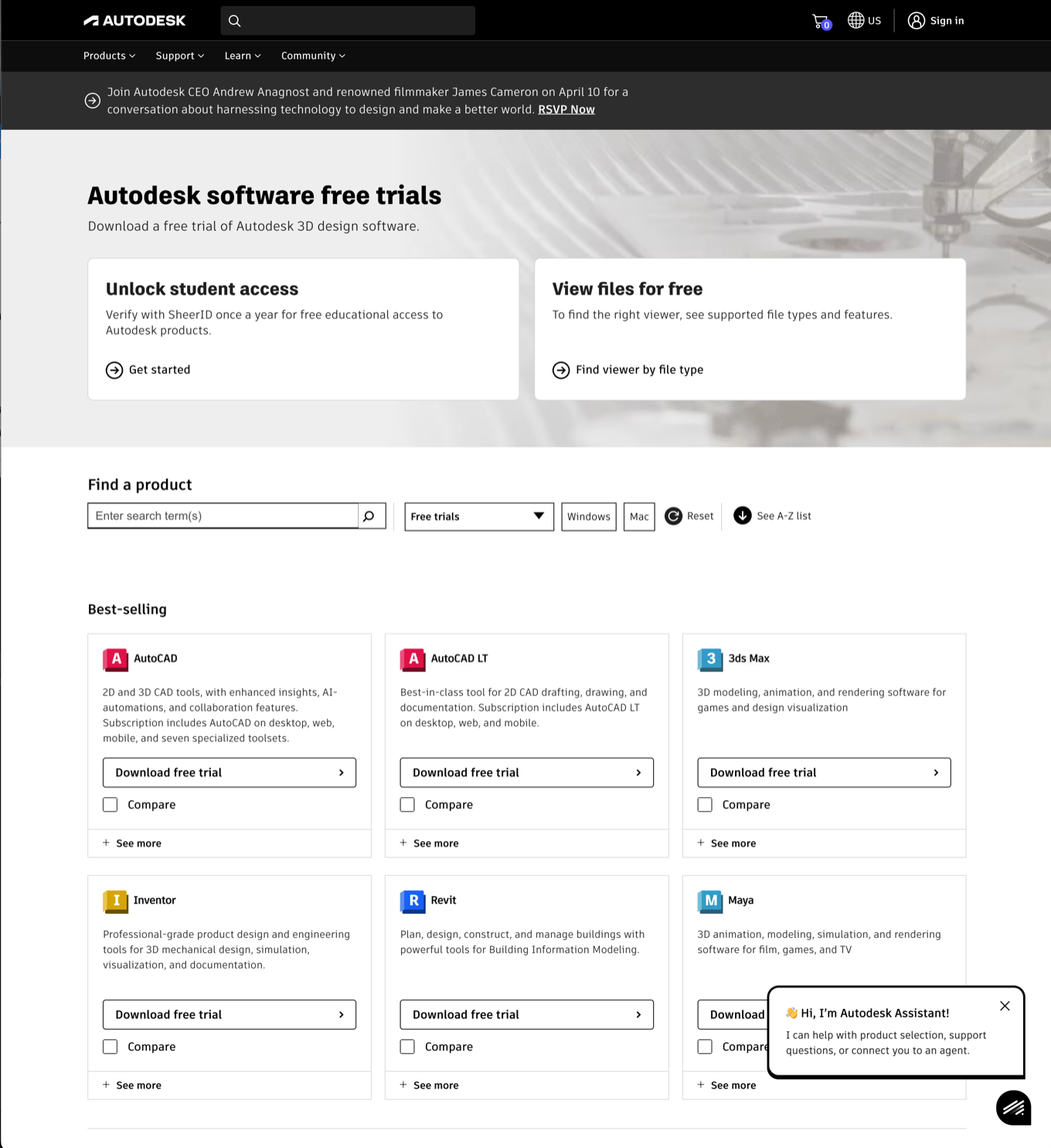
We looked to simplify both the logic and the messaging, so each visitor could tell which path was theirs.
The Trial FAQ got the same treatment. Answers were shortened, and each one now told people what to do.
Act 3:Before the first launch
Starting a trial wasn’t the end of it. By some counts, downloading and installing a product took over 70 screens before the app opened. Then the steep learning curve was still waiting.
Once inside, people met takeover screens urging them to subscribe now, along with upsell messages. Help links pointed to a forum or a support section that was less than helpful.
We wanted a simpler experience, shaped by who you were and where you worked. Students should see something different from admins. Hobbyists emerged as a new persona, and together with education users they made up a statistically significant share of the nurture program.
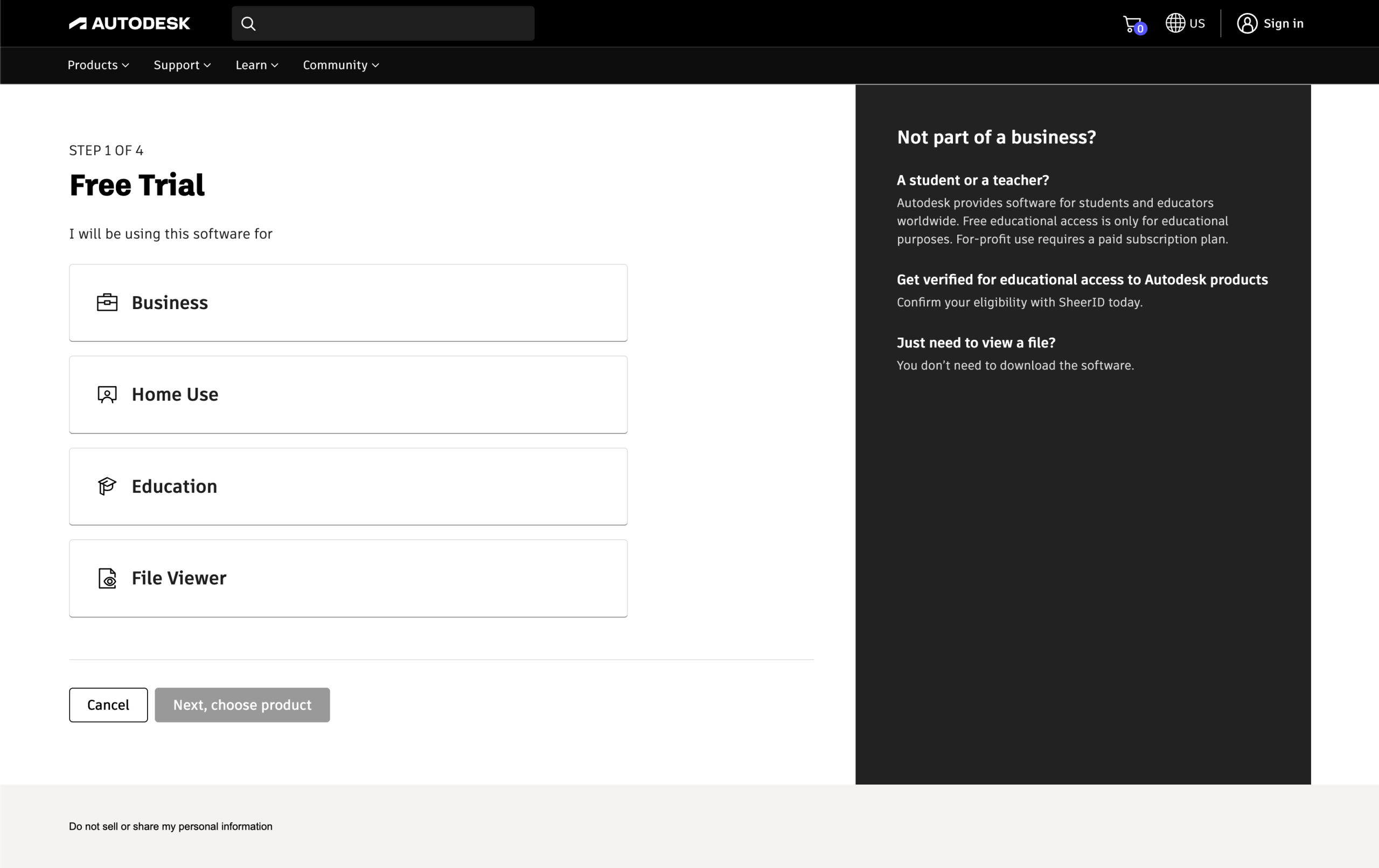
None of this happened at once. It was a long crawl, and it came in steps, across teams that each owned a piece of the path.
Act 4:Viewers, consolidated
Legacy viewer pages mixed non-responsive designs, weren’t well maintained, and were being deprecated in favor of newer products.
The new Autodesk Viewer consolidated a browser experience for reading over 80 file types. DWG TrueView remained the dedicated tool for Autodesk’s most popular file format. The AutoCAD mobile web app was repositioned as the entry-level AutoCAD for editing and collaboration at the lowest rate.
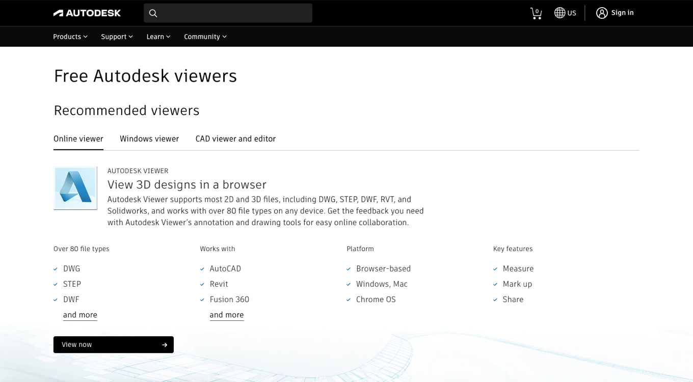
Pages built on the new patterns could be updated with a single service ticket, typically in under 24 hours. The hard-coded, non-responsive HTML they replaced was retired.
PostScript
Students and viewer seekers got their own doors, and trialers got a clearer one. The bigger lesson was structural. A trial is the start of onboarding, not the end of consideration, and the lifecycle split made that easy to miss.
This is one story from a longer run of work at Autodesk. The Autodesk page carries the rest, and Making payment methods findable picks up after the purchase.
Visitors landing in the wrong place?
Let’s give each of them their own door.