Intuit People Experience · content design
One portal, every region
Intuit’s global HR benefits portal answered pay, equity, and payroll questions for employees in a dozen countries with pages written as if everyone was the same employee in the same place. This is how an existing design system got put to work organizing it around the reader instead.
Content Designer, People Experience Solutions. Working inside an established design system with HR, legal, and UX partners. Sep to Nov 2024.
Problem
Intuit’s global benefits portal spoke to employees in a dozen countries as if they were one employee in one place.
Move
Regroup pay, equity, and benefits content by role, region, and employment type, using the portal’s existing pattern library.
Outcome
One benefits portal, organized around the reader instead of the policy.
The context
Intuit runs a large internal HR portal covering pay, equity, benefits, and payroll for employees across a dozen countries. Underneath it sits a real content management system with an established design system and pattern library, built and maintained well before I joined.
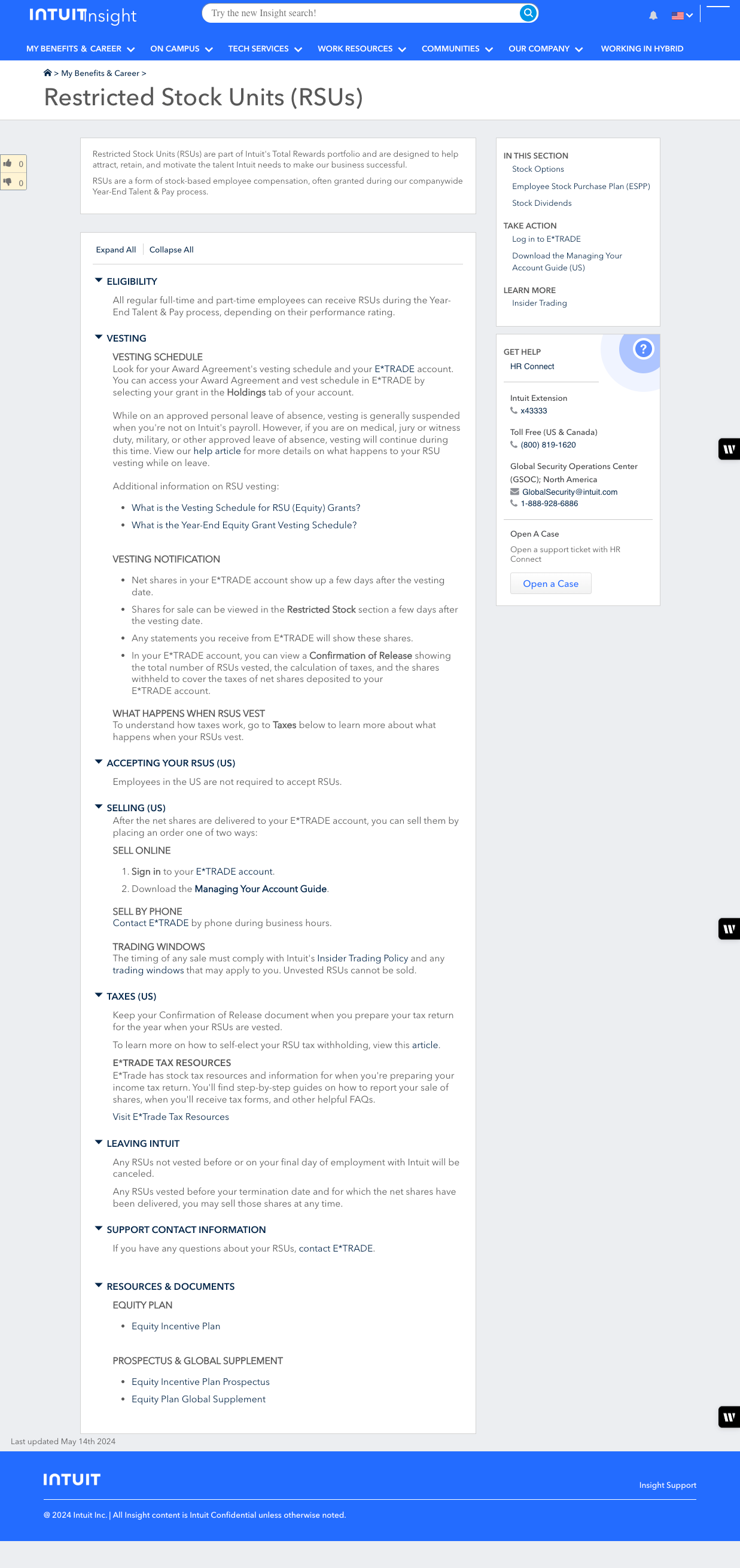
A lot of the content had not kept pace with the system it lived in. Pages like Restricted Stock Units were long, deeply nested accordions: eligibility, vesting, selling, trading windows, taxes, and support contacts all stacked in one scroll, written the same way for every reader regardless of role, region, or how much of it applied to them.
I joined the People Experience team as content designer, working from a large content management system migration effort already underway. My job was reorganizing the content itself: recommending what got grouped together, what got written for whom, and how it stayed that way as policy details changed across regions and employee types.
Act 1:Inside an existing system
None of this called for new components. The pattern library already had card layouts, short action links, and mostly consistent labeling. What it needed was some thoughtful attention and better groupings by interests and basic information architecture.
Pay, stocks, and financial benefits became the proof of that shift. Instead of one page per topic, the content split into cards for each instrument, employee stock purchase, restricted stock units, the management stock purchase program, stock options, stock dividends, each carrying the same three-part pattern: take action, learn more, get help.

The repeated pattern did the work that a longer explanation would have done on the old page. A reader could skip straight to the card that matched what they came for.
Act 2:One portal, many audiences
Once the pattern existed, the harder question was what to group by. A single employee’s benefits page can reasonably be organized around role, region, or employment type, and this portal needed all three at different points, not one taxonomy applied everywhere.

Role was the clearest case. Incentive pay at Intuit is not one plan, it is several, and which one applies depends entirely on the job. The equity incentive plan page grouped its content by plan type first, informal performance incentive, customer care incentive, expert network incentive, sales incentive compensation, seasonal TurboTax Live Expert, so a reader landed on the section written for their role rather than reading past four plans that did not apply to them.
Proposals like this were built and reviewed in Figma alongside product management, UX, and visual design, using the same pattern library components as anything that shipped.
Act 3:Publishing at global scale
None of this holds together without a way to keep it current. Business requests came in weekly from HR line-of-business stakeholders, and every one had to pass through the same people: UX, visual design, and subject matter experts from the teams that actually owned the policy being described.
Two tools made that cadence possible: Writer, trained on Intuit’s own voice and tone standards, and ServiceNow, used alongside Google Docs to route and track each request.
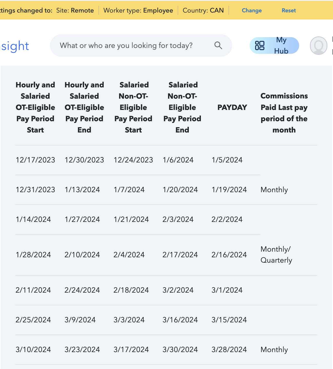
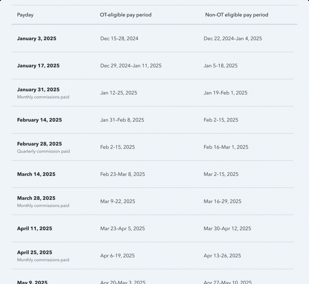
The payroll calendar is where the scale is easiest to see. The same layout, a payday next to its pay period, repeats across seven separate country pages, each one accurate to that region’s calendar and holidays, each one someone else’s area of expertise.
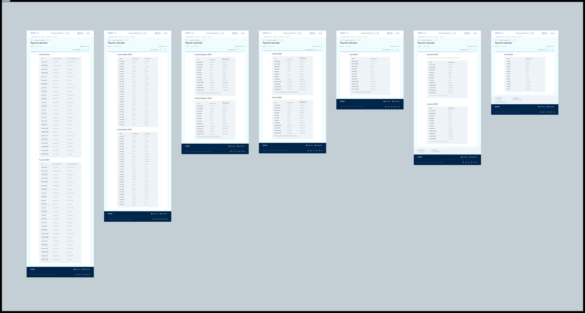
Seven regions on one template only work if the template can carry real differences without turning into seven different pages. That is a content operations problem as much as a writing one, and it is the reason the tooling behind these pages mattered as much as the pages themselves.
PostScript
This project did not launch a feature. It reorganized one that already existed, inside a design system I did not build, at a scale that only holds together if the underlying content operations work. The measure of it is a portal that can be grouped by role, by employment type, or by region, and still reads as one consistent system rather than seven separate ones.
It is a different kind of work than the first project I did at Intuit, years earlier on another team. That one shipped a net-new capability into QuickBooks Online. This one is about what it takes to keep a much larger, already-shipped system honest as it grows.
Need to work on your portal?
I can help you consolidate and optimize the experience.