Autodesk · commerce platform design
From discovery to subscription
A multi-year journey to transform how millions of visitors discover, consider, buy, and manage professional design software at scale.
Role
Principal Content Designer, XD Strategy Team
Scope
Discovery, consideration, payments, and payment management
Timeline
July 2019 to February 2024
Outcome
20% trial starts, 8% conversion
Context
Autodesk is an American software company best known for making 3D design, engineering, and entertainment software like AutoCAD, Revit, and Maya. Autodesk.com has become one of the largest software commerce surfaces in the world serving architects, civil and structural engineers, manufacturers, designers, and animators across dozens of countries, and transacting in multiple currencies, and with a range of consumption models.

In 2019, I began my multi-year journey working to transform the the full customer journey. From free subscriptions for educational institutions to providing paid access for designers from some of the largest users of 3D software in the world.
The XD Strategy Team I joined worked horizontally across all web experiences built for prospects, customers, agents, and partners. When I joined, domains for marketing, support, and user communities were each hosted on three separate publishing platforms.
Outside the US, a mix of third-party vendors were needed to handle payment processing, a legacy from the days when the entire process was exclusively handled by resellers.
One header for three domains
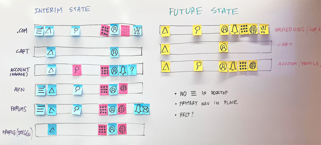
Universal Header Navigation ran in parallel as a persistent layer. Consolidating to a unified state was a multi-year that began with a seemingly simple Me menu. It took close to a year and was followed quickly by the country-language selector, and a product fly out.
I served as UX content lead on the navigation label explorations, working with the chief information architect to construct one legible surface across every domain and in each country Autodesk products and services were sold.
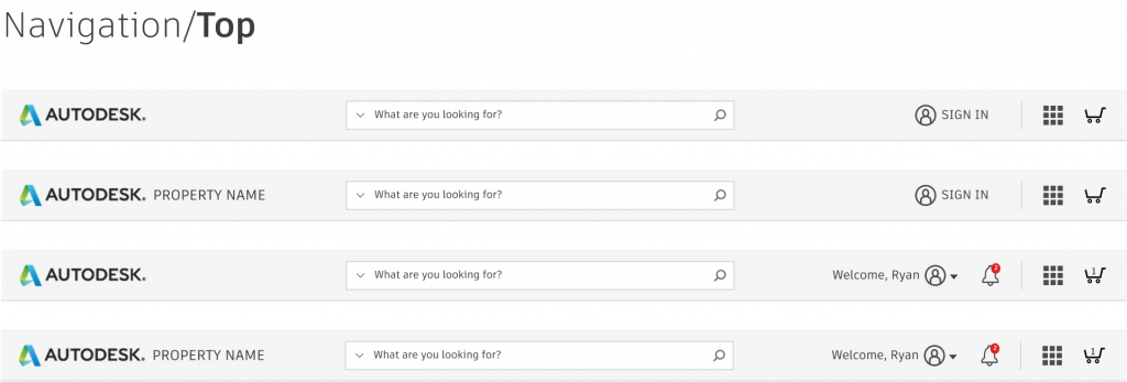
Detailed audits of all the existing navigation systems were conducted, along with relevant mobile and desktop navigation centered on the FANG (Facebook, Apple, Amazon, Netflix, and Google) and direct competitors.
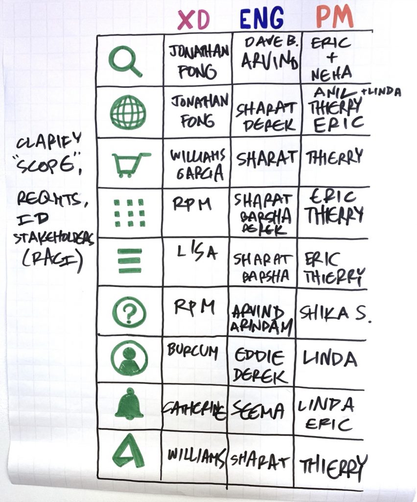
A troika of Experience Design, Engineering, and Product Management divided areas of scope, requirements, and technical hurdles documented for building a single unified navigation.
This became the road map to unify the three domains with a common navigation structure in over 150 countries. We started with a Me menu and took that first step.
Act 1: Discovery
The North Star project
The was made up of UX and visual designers, full stack engineers, researchers, and content strategists from all across the organization. Our focus was a re-imagining of critical touch points, approached through the lens of personas representing key demographics, grounded in industry trends, research, and historical data gathered.
The approach typically started with a state of the current problem. What it represented in opportunity costs, or missed opportunities to delight and then shifted to What if we…
- knew the customer better?
- could personalize based upon who they were?
- could anticipate what they needed?
The site’s existing navigation, product pages, and pattern library were challenging to build upon and optimize. With a catalog of nearly 100 products, it was difficult to enforce all products to adopt them and optimize at scale.
Adding to the complexity, A/B tests run on a high-traffic product page like AutoCAD might not tell us anything useful about more niche products like Autodesk Alias.
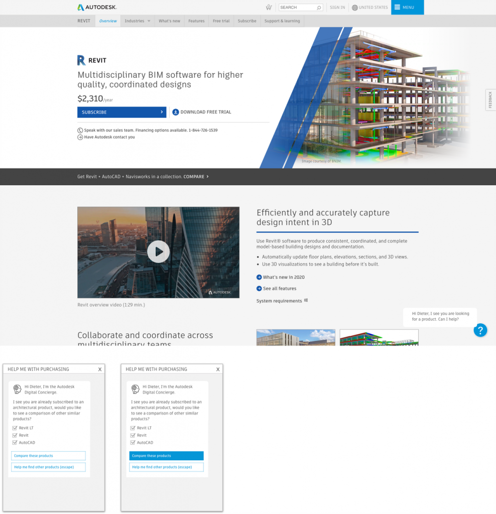
The net outcomes of the North Star were to inspirations and high fidelity mockups that were built to show what was possible. This investment in future innovations would inform the design improvements that followed in the years to come.
Prioritization
The Gateways Pod was charged with optimizing and prioritizing the high-traffic landing pages. Research, analytics, and page performance informed our tactical objectives, while UX leadership drove strategic goals, some inspired by the North Star, that would help us achieve the next-level growth.
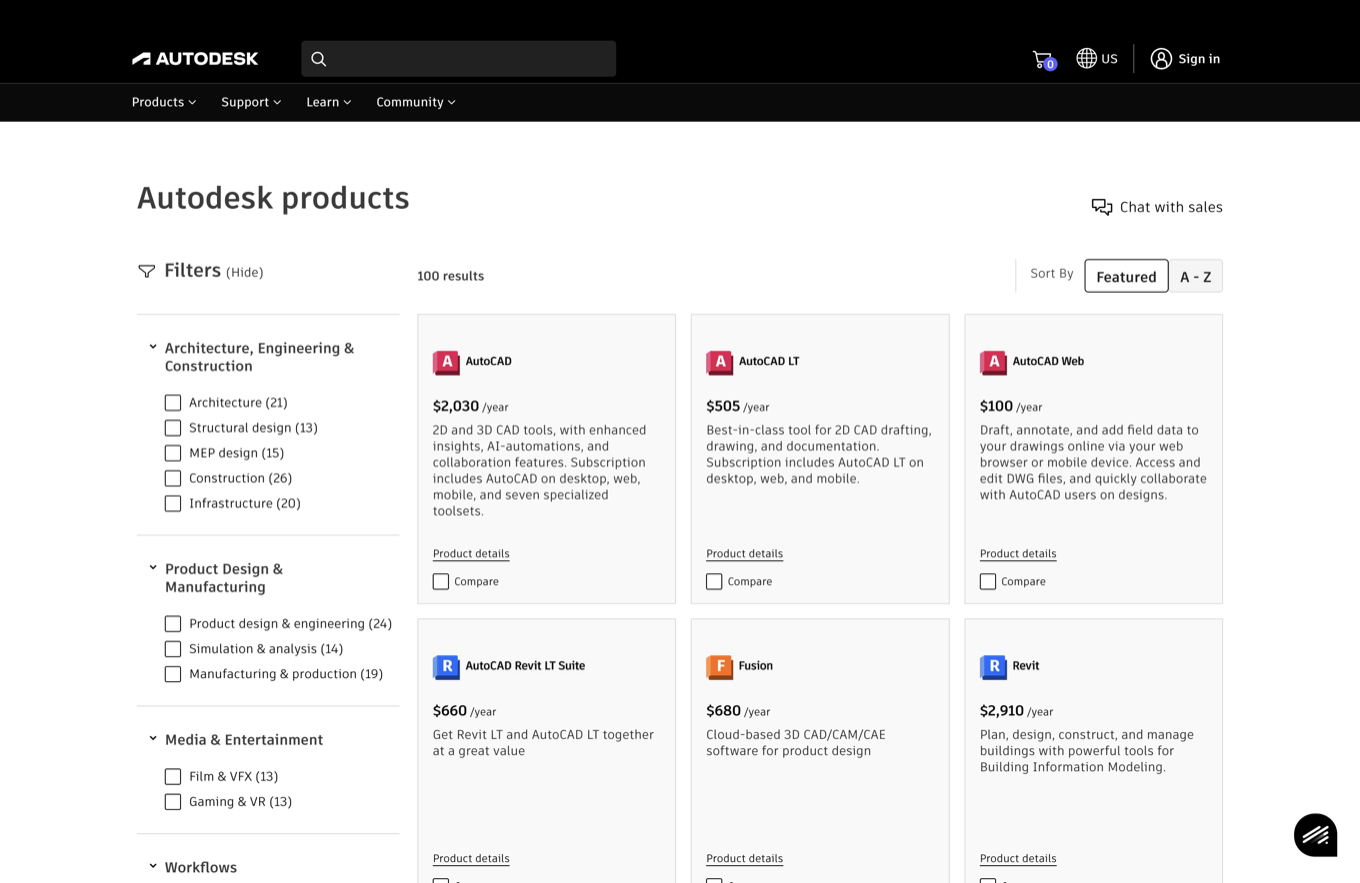
Initially, there were four pages competing for the same traffic: the Free Trials, The Buy page, The All Products, and the Product Center. Each served a different state of discovery, consideration, and subscription.
The consolidated All Products page became a single discovery surface for the full catalog. A filtering mechanism was built for easier sorting and faster page loads for top products.

Defining the industry categories and workflows was content work. I collaborated with technical product marketing SMEs to name and structure the industry categories customers actually think in.
Reason for visit: The Free Trials insight
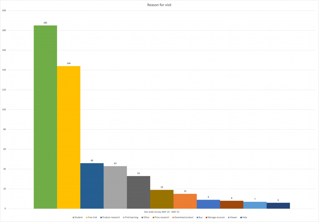
Free trials are a well-paved path to subscription growth. Qualtrics data revealed many visitors were left feeling frustrated. The research findings told a story of misdirection, unnecessary frustration, and an opportunity to harden the systems. Specifically:
- Most visitors were students (or pretending to be) looking for educational access.
- Search traffic seeking free student software was cannibalizing our commercial organic search traffic.
- A significant subset needed only a free viewer to open a 3D file.
The response was to stop treating every visitor as a trial prospect: prioritize affordances for educational access and viewers, and experiment with placement of the Educational Access and Free Viewers cards so each audience found its path without derailing the commercial one. The result was improved trial activations.
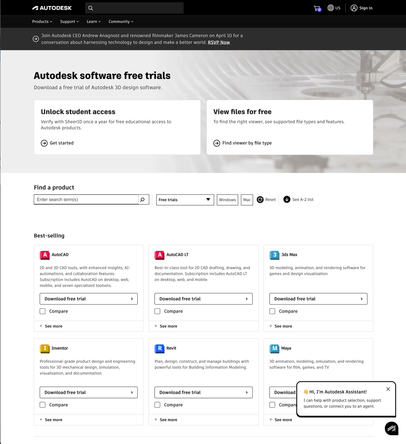
Viewers, consolidated
Legacy viewer pages were a mix of non-responsive page designs and by comparison to commercial products, were not well maintained and being deprecated in favor of newer products.
The new Autodesk Viewer consolidated a browser experience for reading over 80 file types; DWG TrueView remained the dedicated tool for Autodesk’s most popular file format; and the AutoCAD mobile web app was repositioned as the entry-level AutoCAD for editing and collaboration at the lowest rate.
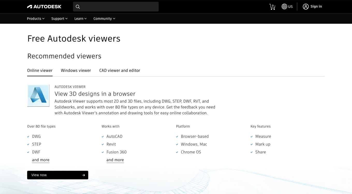
Improvements made with newly published patterns meant these pages could be updated with a single service ticket, typically in under 24 hours and more peformant pages able to be deployed in regional markets faster. The legacy pages they replaced meant an end to hard-coded, non-responsive HTML.
Act 2: Consideration
Comparing products
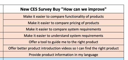
Choosing between professional tools was harder than it needed to be, and comparing products was historically a top source of low customer effort scores. Search traffic for product comparisons was dominated by companies representing themselves as experts, often with incorrect or outdated data, and those sites ranked well above Autodesk’s own organic results.
Customers struggled to find system requirements, pricing and product differentiation lacked transparency, and duplicate product information (educational versus commercial) cannibalized each other’s search traffic.
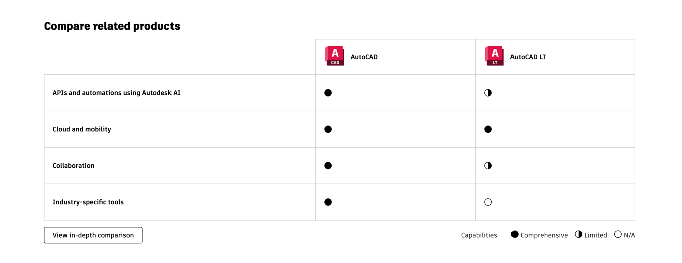
The resulting request was for a new comparison framework: a flexible template added to the pattern library, with limits on comparing unrelated product families, curated workflows for high-level views, linking components for deeper dives, and usage guidelines so publishing teams could deploy comparisons without design intervention.
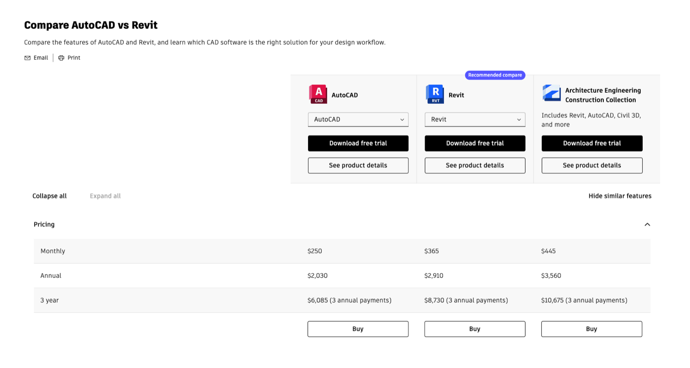
I built the pilot comparisons for the six most-searched products in consultation with technical product marketing SMEs, worked with product marketing to assemble the comparison content tables and choose which products to compare, and developed and published the usage guidelines. A compare panel component brought high-level workflow comparisons onto product center landing pages, and an in-depth view handled up to three products at once.
The results: reduced time to publish and optimize comparisons, improved SERP rankings for top Autodesk product comparisons, and increased engagement with product centers and trials.
Fusion: graduating from incubation
In 2019, Fusion 360 was still in incubation and only available in some markets. As such they were allowed to run one-off experiments with fewer guard rails such as those in place for AutoCAD, Revit, or Maya.
Following a successful incubation period, and now renamed, Autodesk Fusion, migrated from a fragmented, one-off look and feel to the standard product center format, rebuilt on pattern library components optimized for performance, flexibility, A/B testing, and scalability across markets.
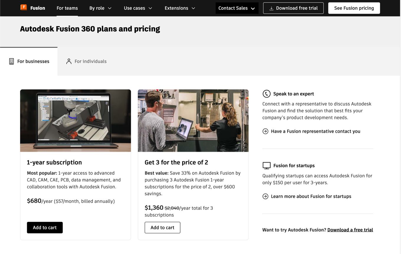
I worked with the UX designer and product marketing team to address personas ranging from free hobbyist users to paid professionals, with integrated comparisons to legacy products and the collection. The results after migration:
- 20% increase in trial starts.
- 8% conversion improvement year over year.
- Improved response time for requested changes.
Educational access at scale
For educational institutions, IT admins enable Autodesk products for students and teachers at scale, and the available consumption models were evolving and hard to parse. The product designer leading the end-to-end overhaul requested help with the content.
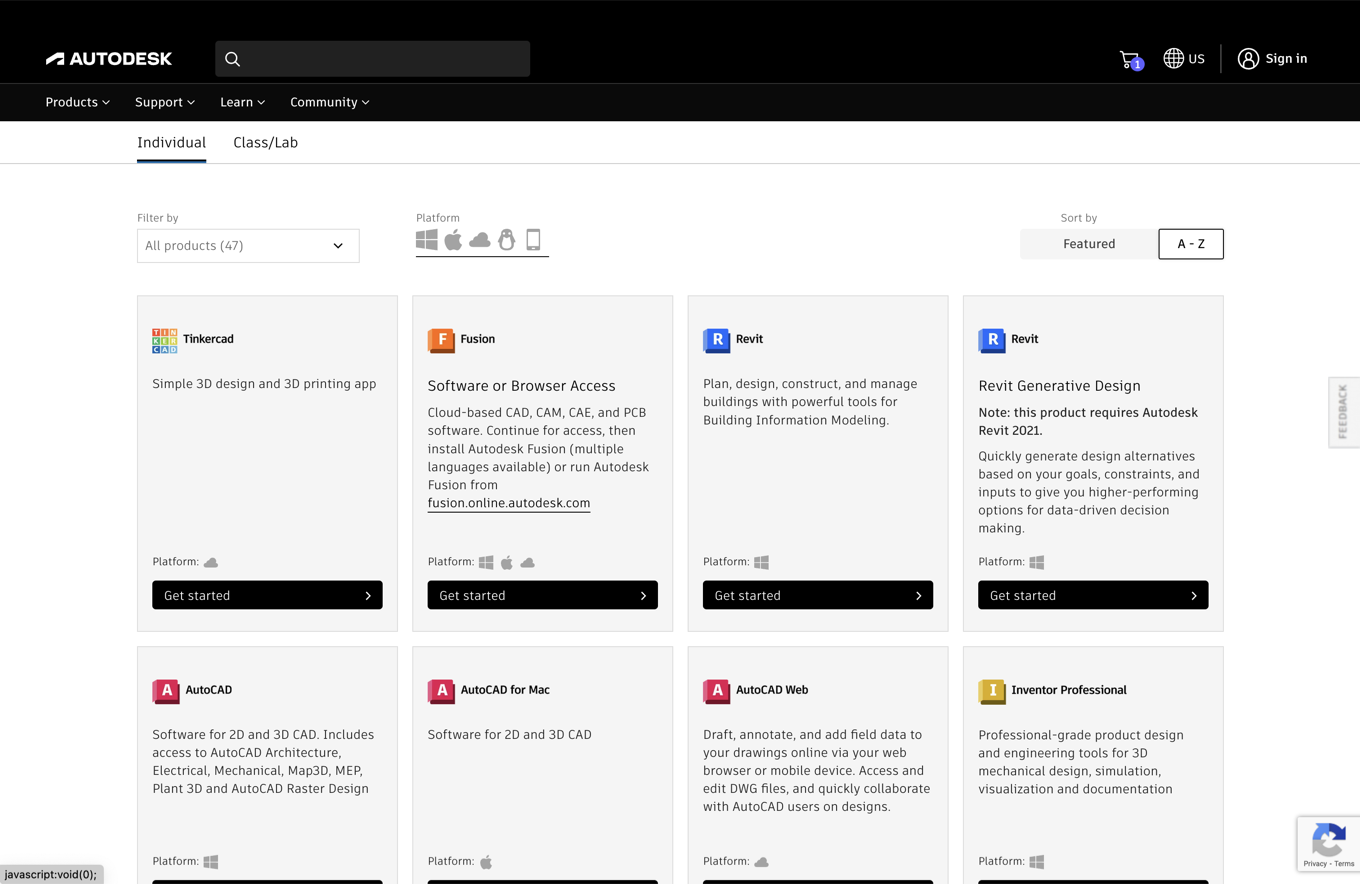
I saw the opportunity to apply the comparison panel, and that format shipped, putting the two IT admin subscription options side by side while recommending the newer one for admins deploying as many as 3,000 seats. The redesign organized onboarding by audience segment using standardized product cards and simplified checkout flows for every segment. The results: reduced time to publish comparisons, checkout aligned with the mini cart patterns from Act 3, and a foundation for easier transition to paid subscriptions.
Act 3: Payments
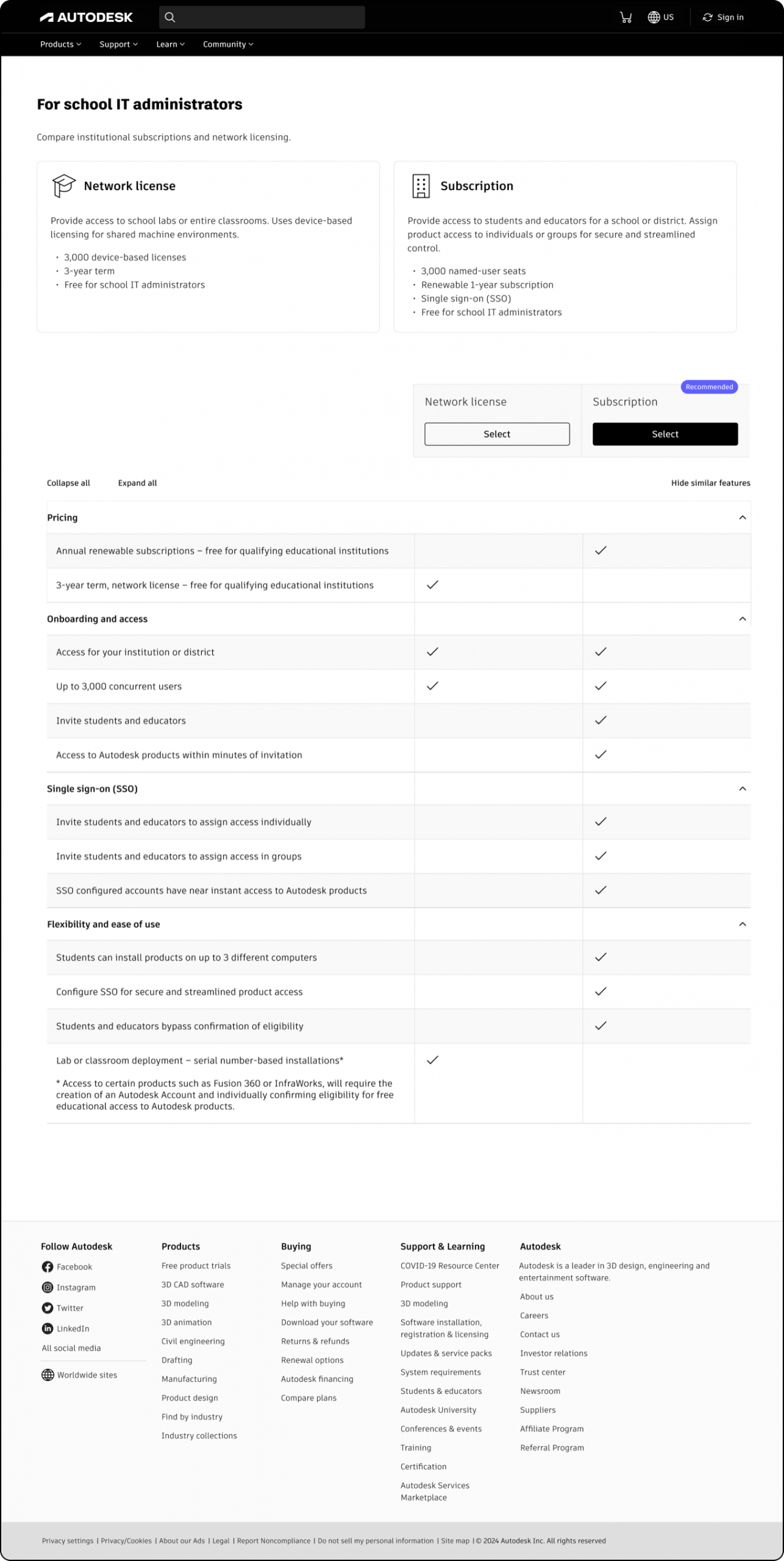
The Buy team owned the payment experience. Composed of micro components driving the moment of commitment: subscriptions, renewals, and an expanding array of consumption methods, from prepaid Flex tokens for occasional usage, to full seats assignable by internal admins for larger deployments, to individual plans for solo users and small teams.
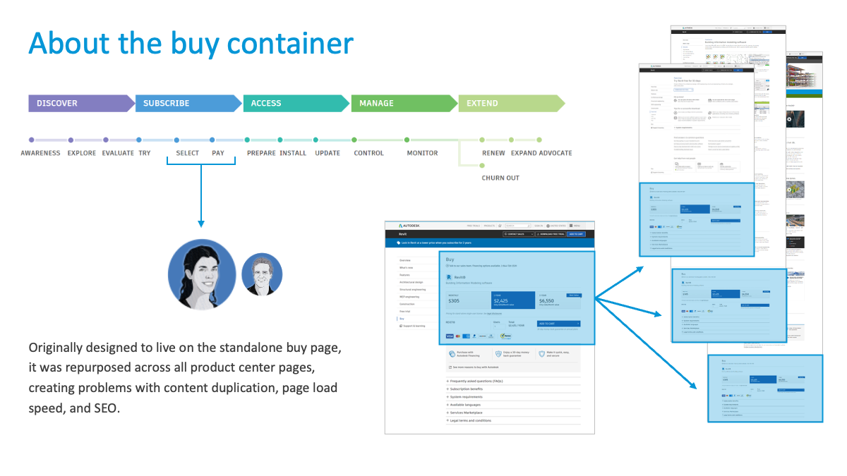
The checkout redesign centered on the right-rail mini cart, a mobile-friendly component built on an extensible framework. One cart architecture to accommodate multiple payment options, incentive messaging, and per-country variations without redesign.
In-cart recommendations and alternative payment methods
Data science and e-commerce teams analyzing historical purchase patterns saw an opportunity: recommend related products in the cart to increase average deal size.
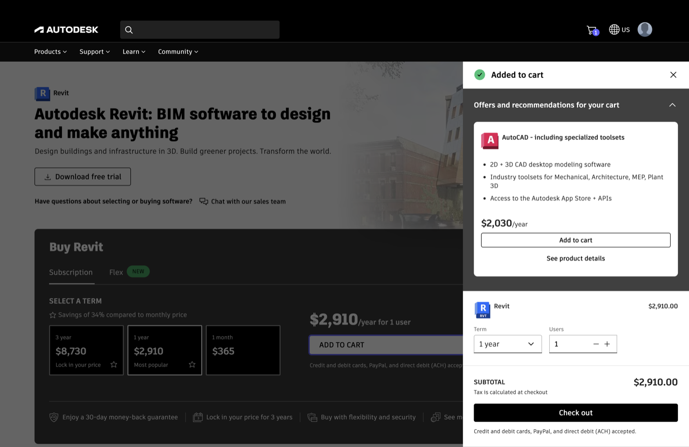
The content problem was harder than the placement problem. A recommendation is only persuasive if it explains why these products belong together. I worked with subject matter experts and technical product marketing leads from each featured product to develop preloaded feature narratives keyed to the original product in the cart: how the combination enables better collaboration, improved documentation control, or faster approval cycles.
Payment capability expanded in parallel: pay by invoice for qualifying customers, self-service financing, and a limited-time 0% financing offer run deliberately as a test of engagement and order size. Payment flows adapted by country, so a buyer in one market saw the options that market actually supported. Cart abandonment messaging went through A/B testing to optimize conversion.
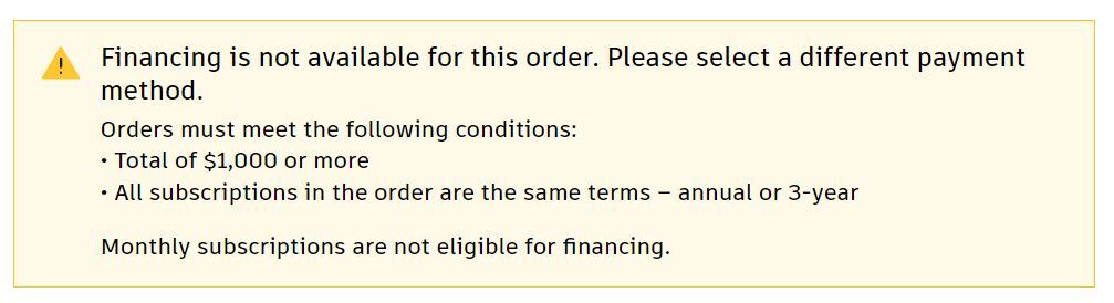
Not every bet paid off. The 0% financing tests ultimately did little to increase deal size, which had been a prime objective. The extensible cart meant the experiment cost little to run and little to retire.
Act 4: Payment Management
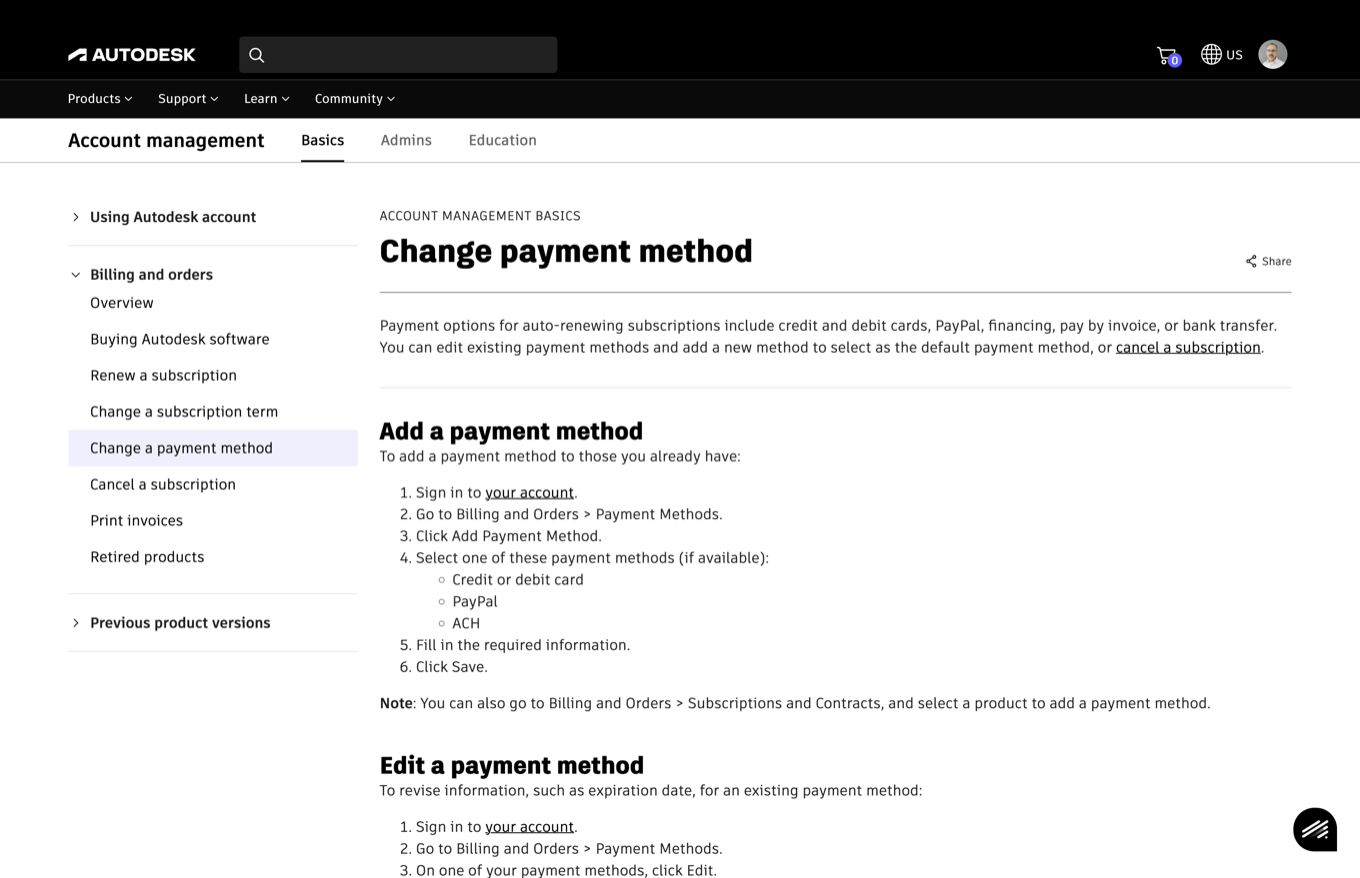
Payment management tools were hard to find and offered limited flexibility, and delinquency rates for subscription renewal were unusually high.
The fix was not a new idea. A self-service payment management access point had been proposed during the North Star work years earlier, then waited through roughly three and a half years of account-side leadership changes and shifting priorities before it was built.
The response: a new self-service payment management option, improving visibility through weighted type-ahead behaviors in search, and simplified instructions available across multiple pre-purchase and post-purchase paths.
The results:
- 122% higher payment management engagement overall.
- 32% increased engagement by delinquent customers.
- $2.4M in revenue saved, a cumulative figure for the six months leading up to February 2024, attributed to the Payment methods access point.
- 12-point improvement in customer effort scores, from 59% to 71%.
For an idea that sat that long, a $2.4M return in its first six months is the case for staying with systems work through the delays.
Close
Despite changes in leadership, the transformation succeeded because we started by designing systems, and the funnel proves it end to end. The taxonomy that organizes discovery feeds the comparison framework that drives consideration; comparisons drive engagement to product centers like Fusion; persona-based options hand off to a cart extensible enough to finance a purchase in almost any market; and the same self-service philosophy carried past the sale into payment management, where it saved measurable revenue.
Need help with scale?
Let’s remove the blockers and start building that dream.